Stanley Arts
Identity, Graphic design, Logo design
2022

The South London borough of Croydon has a rich and active LGBTQ+ community that contributes to the arts and culture of the area. Croydon was selected to be the London Borough of Culture for 2023. As a part of that, Queer Croydon was created to help highlight the cultural production of the LGBTQ+ community, with help from Stanley Arts and Their Majesties.
From Queer Croydon:
"We are an open platform for queer stories & events from Croydon and South London, sharing content across our website and social channels. We are also going to be producing our own Queer Croydon live events, showcasing the very best of local queer talent."

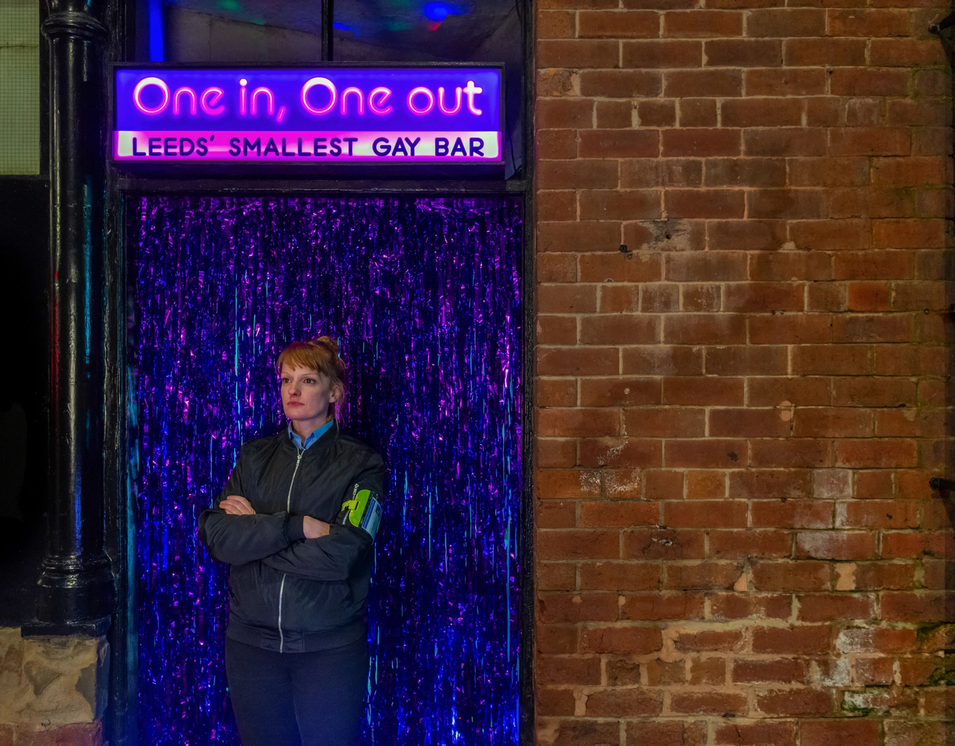
Photos by Queer Croydon.
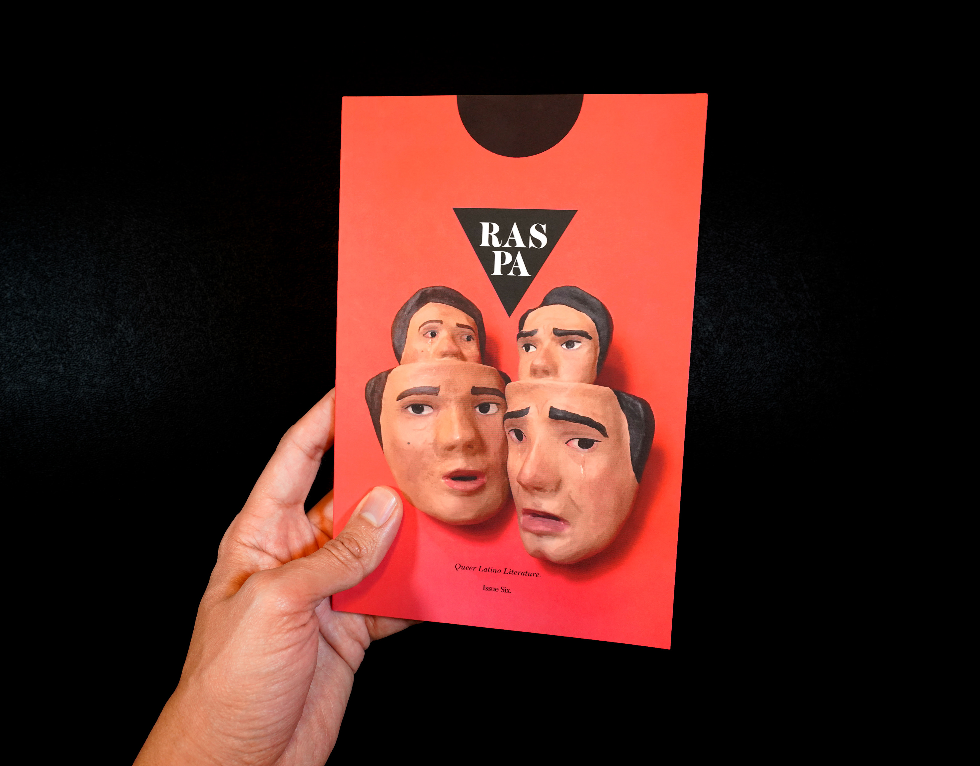
While researching the LGBTQ+ graphics in Croydon inverted triangles came up a lot. This symbol comes from a dark period of history. A pink triangle was a symbol used to label homosexuals during Nazi persecution. A black inverted triangle was used for ‘asocial’ individuals, including lesbians. Since the 80’s the triangle has been reclaimed as a symbol of pride, much like the term ‘queer’.
The Queer Croydon logo was applied along with the 2023 London Borough of Culture’s This is Croydon campaign by Designblock. The logo for Queer Croydon aligns with the campaign through typeface selection, colour palette, and integrating the existing triangle element from the campaign.

The identity uses fuchsia and violet colours. Both colours have long histories in queer culture. Sappho, the ancient Greek lesbian poet, often referenced violets in her work about love between women. Fuchsia was used in the inverted triangle designs for the ACT-UP HIV and AIDS awareness campaigns for a sense of urgency in the late 1980’s.


Website design by Designblock and build by Hover State.


Stanley Arts, Arts & Community Producer: Vicky Olusanya
Stanley Arts, Artistic Director & CEO: Dr Daniel Winder